My Logo and Branding Design Process - from sketching to presenting to the client

So let’s set the scene, you’ve done hours of research, the client loves your mood boards so you are ready to jump into the design stage! So what does that look like? In this blog post, I’m going to explain every step — from sketching ideas and finding fonts, to choosing the routes to take forward to my clients.
My branding and logo design packages are a carefully designed three step process based on my experience as an agency designer.
I love this process as it allows structure and predictability, while also giving the client flexibility and the chance to really understand every step and how the brand will shape their business. Before starting the logo design process, I present my clients with a research stage, various moodboards and we verbally agree the ideas to take forward. So I can come into this process with full confidence and the support of my clients.
To give you a very quick summary, stage one is all about research presentations, target audience exploration and connecting with the client about their values and goals. Then in step two (this stage!), I take this research and start sketching, finding typography, colour palettes, taking the design to the computer and building a cohesive logo presentation for my client.
Step three is then all about adjustments, artworking, creating brand guidelines and offering advice on how best to use their brand, what their next steps could be. Generally ensuring that the client has everything they need and complete confidence in their new brand.
This post is all about stage two - how do we pull together designs and a complete client presentation based off of our careful research. One that fully matches the client’s values, goals, and fits in perfectly with their audience. So - let’s go!

Reviewing the Research
I usually grab a pot of tea and still down with my notes, the research stage presentation, moodboards and my client’s feedback on the presentation. I always present my research stage to the client over a video call so I get some clear ideas into what they are leaning towards and we can discuss two clear routes forwards for their brand. Confirming these routes on the call gives me the confidence I need to move forward and allows myself to discuss how each route will affect the brand with the client.
So with my moodboards and sign off from the client on the two routes to take - I make a note of each route, the colours, typography styles used and thinking about these factors as I sketch.

Sketching
I’ve always felt that sketching isn’t always encouraged at this stage of the process but I love it. When you draw out every single idea that comes into your head, even the silly ones, you start to see how different letters could come together, what layout feels best. It can become a really quick and useful tool. I try and block out an hour or so to do this, I usually get distracted and make a second batch of tea but when I look at the sketches after time has passed I always see something different.
I was always told the trick is to sketch quickly and not worry too much about if you haven’t drawn something perfect. It’s just about getting ideas down on the page.

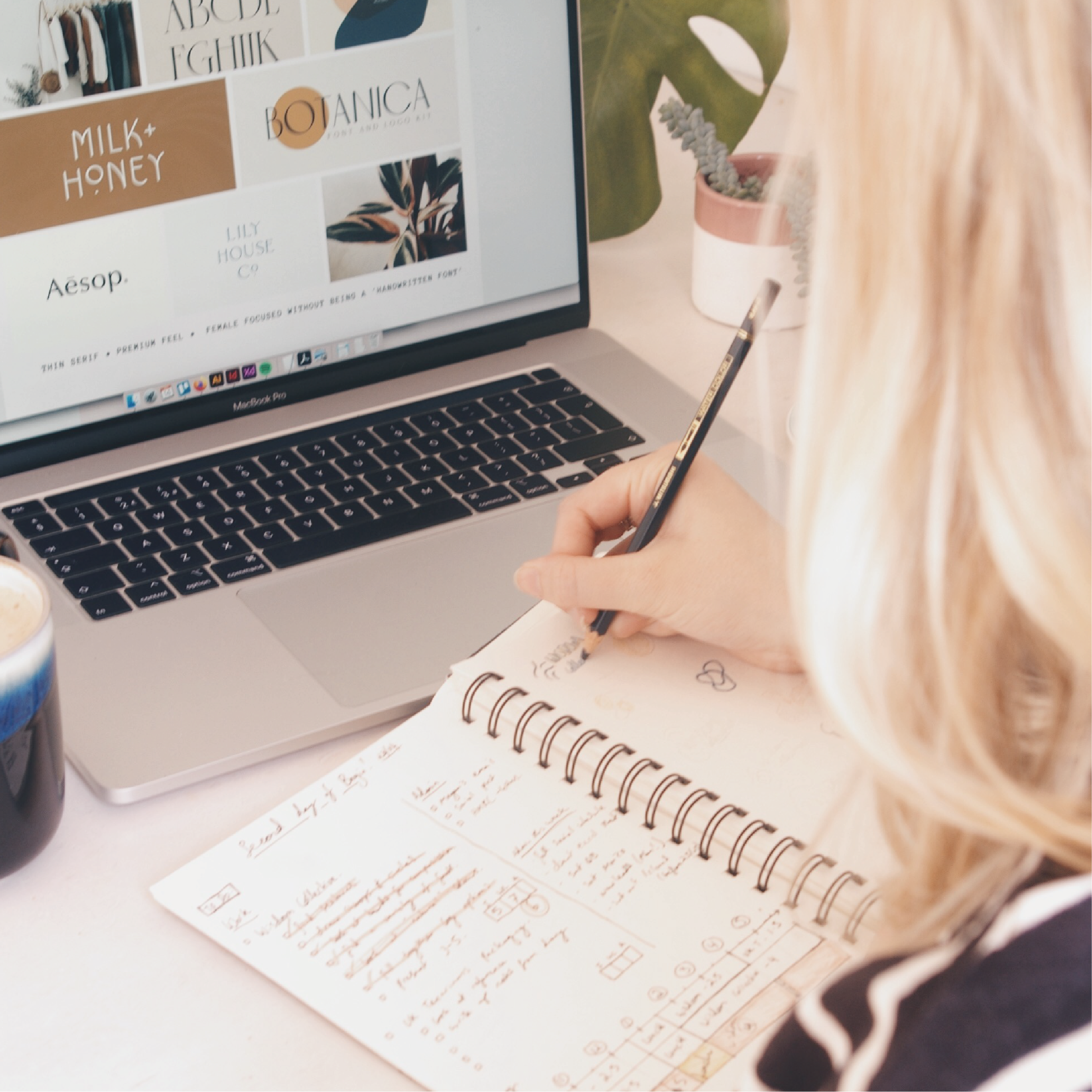
Typography
I usually get typography inspiration from looking at the moodboards - does this vibe fit a serif font or a sans serif? If it’s more casual, modern or approachable then Sans Serif. If it has premium qualities or traditional routes then a Serif. Although, these rules aren’t black and white - one of my favourite fonts “Classico URW’ is an extremely luxurious and modern sans serif.
You also need to bear in mind that all good brands have a secondary font to help keep their designs flexible, if it’s a serif brand then this is usually a Sans serif font or vice versa. Some brands even have a THIRD font, usually a script or something really different and impactful to add a flair to their visuals.
Once I have characteristics down, then I type the business name into Adobe Illustrator using the type tool about 40 times. Then I find a different font for each one so I can visually compare them and find the perfect pair for the project, making sure to check in with the characteristics frequently. I search Google Fonts if it has a web design element or Adobe Typekit if it is purely branding. This is mainly due to ease and also licensing rules, which I’m hoping to expand on in a future post!
Finally, I start pulling fonts together on an artboard to create compositions, using my sketches as a reference.

Colour Palettes
Again, I usually get my colour inspiration from what I’ve placed on my moodboard and the feedback from my research. Colour is so important and it’s something client’s really pick up on. My favourite way to find colours is to look at lifestyle photos that fit the clients vibe and take swatches from them. Then I put them into circles, compare the circles, add colours, take colours away until it’s perfect.
For me, I like a palette to have a light colour (usually white or cream), a dark colour that isn’t always pure black and then some fun key colours that we can use for CTA’s or on their website. Having this full range ensures that the palette is really flexible for whatever the client needs now or in the future.

Illustrations
Often, a client will ask for an illustration or monogram in their logo. This is created at this stage so that when I draw the element, I can look at the typography for inspiration about the width of the line. It also helps to have the other elements nearly there so that you can see if your illustration idea fits with the typography, colours and the clients brief. For example, if I spent a hour or two crafting a vintage teapot but then realised it doesn’t go with the Sans Serif, bright coloured brand then I would have to adapt it to be something really different. So having an idea of how to bring it all together is really important.
To draw the icons, I use the vector tool in illustrator and often sketch out what I want to do in pencil as a reference and so I don’t get distracted!

Pull elements together and create an additional graphics
I take this opportunity to pair the typography with the colours, then add the mark. Maybe trying a few different layouts and referencing my sketches and notes. Try multiple combinations and colours to see what works the best and what matches the brief.
After you have these compositions you can use the chosen typography, colours and marks to create secondary logos. It’s really important to me to provide secondary and even third logos for my clients. It allows you to give them complete flexibility and control of their brand. It also ensures they have a logo for every occasion so you can prevent them from accidentally cropping a landscape logo in their circle profile pic for Instagram.
You can also use it as an opportunity to be creative. You can introduce script fonts, other colours from their brands, patterns dates that they were established. As long as it compliments their core logo and their brand.
Choosing all the best bits to send to the client
For me personally, this is the easiest part. You’ve worked for a day or two and you have 3-4 routes and layouts that are really working for you.
You will always have an route that you know instinctively is the best but I always like to reread the research presentation and client notes at this stage — just to triple check that my options are in line with what I discussed with the client and what our research says is the best way forward for us. Then I’ll choose the two routes that I feel perfectly represent the brief, the client and the market the best.
There’s bonus points if the routes are very different. As I’ve always found that two very different routes usually help the clients make a clearer decision as they can see instantly what they like less.
Pulling together the final presentation
Once you’ve got it down to the two you’re going to send and you’ve exported each logo and element as an EPS so it can be easily placed in InDesign. I like to present my clients with a Begin Studio branded presentation that shows each route separately and very intentionally. These presentations are a great tool to really sell your ideas to the client and remind them of the research that you discussed at length and agreed on.
Here is my full list of what I present for EVERY route:
A reminder of the key notes we discussed
A page reminding them of our mood board and research references
The main logo on it’s own without any notes so it’s really impactful
The main logo in white on a coloured background
A page that describes my thought process
A page that showcases any secondary logos or additional elements
A quick website visual that shows the brand colours, logo and the brand fonts interacting on a page. I find this is REALLY useful, it allows the client to see it coming together and it isn’t too time consuming to do if you use a rough template and very generic copy.
I round up the section with a circle overview of the colour palette and any notes I have on it.
Phew! It’s definitely very chunky but you don’t need to build it everytime. You can use a master template and tweak it slightly depending on the client, the brief and the amount of routes you want to show.
The End!
Thanks so much for reading - goodness that was a long one! I hope you found these pointers helpful and remember you can download my checklist (both for web and for print). And lastly, if you have any questions feel free to reach out or comment below. :)

For offers and resources directly into your inbox. ✨