Take what you need: 12 Quick Design Adjustments to improve your brand
When I work on creative projects, there’s always an element of problem-solving. I ask about your brand values, where you want to be and how you want to communicate your business and create a strategy that solves all those problems, hits all those notes, clearly communicates your values and with a design you love.
I would bet that even if you’ve created a DIY brand, you’ve done the same thing. You thought about how you want to be perceived and created a brand around what you think your clients or customers want to see.
However, sometimes the solution isn’t as obvious and you might feel stuck and not sure what adjustments need to be made. So I’ve pulled together 12 design strategies that I use in my own work with a description of why they are important and some further ideas for you to think about!
“How can I make my logo or brand more fun?”
1. Boosting your brand colours by adding saturation:
If you have a set of brand colours that are working well for you, adding a touch of brightness and saturation to the colours can be a great step to add more fun to a brand without changing the design.
Using the Coolors website (a popular colour generating website, you can put in your brand colours and then use the “View Shades” option to see brighter shades.
2. Adding some playful graphics to your website or proposals:
Graphics or hand-drawn icons have a great reputation for allowing a brand to feel looser, more approachable and more playful. If a client comes to me and is looking to have a playful edge to their brand but their colours and fonts are working well - I always recommend adding some graphics to make their proposals and website pages more playful.
Consider using graphics that are related to your industry, drawings that capture a part of your process or consider using abstract shapes that just communicate that lovely loose quality.
For example, if I was working for a florist - I would recommend either
Sketches or handdrawn icons of their favorite flowers or plants
Process visuals such as ribbons, pots and cutting scissors
And lastly, for an abstract approach, I would recommend loose visuals based on leaves, flowers, sun - anything that feels soft and flowy!
The Content Creator project can be viewed here. Work by Begin Studio
3. Highlighting your text with fun colours or shapes:
This one is a simple twist but offers a really nice shift as it can transform simple text into feeling more playful and unique. Consider using highlights, swirls, circles or shapes to add impact and fun to important words and statements on your website and also on your printed materials or proposals.
Squarespace has now added the option to highlight your text in all these ways and more! You can even add animations if you want your site to move and feel more elevated.
An example of text highlighting in Squarespace. Work by Begin Studio
4. Ensuring CTAs are bright, impactful and stand out with fun colours:
Call to actions are one of the most important part of any website, proposal or printed piece as they instruct the viewer on what to do next and encourage them to reach out and work with you. If you are looking for a brand or website that feels fun, I usually recommend ensuring the CTA bar, button or part of the site is highlighted with a colour so that it really grabs the viewers attention.
“How can I make my logo or brand more high end or premium?”
1. Ensure your website, proposals or social media aren’t too busy or cluttered:
This one is probably the trickiest adjustment here to make, but it can be the most important. Not over-filling your designs and utilising white space on premium design is crucial to any premium brand. Consider a high-end car ad or an advert for Cartier - high-end brands have to be clean, confident and crisp to communicate their high price point.
My biggest tip when designing for a high end brand is to ensure at least 60% of the design isn’t full of designs or typography. It might seem like a lot, but trust me! It’s a great starting point. Another tip is to ensure the text of your website isn’t too big.
2. Consider switching to a lighter brand font or serif:
If you are using a heavy or chunky font, such as Bebas, Helvetica or another sans serif font. Consider switching to a cleaner sans serif or more spacious serif font. Some of my favourites for high-end brands include:
Logo in Optima - Work by Begin Studio
3. Use clean graphics or sharp lines to add a premium edge:
Simple icon logos, sharp and clean lines and clear fonts are the hallmarks of premium design. So lean into this as much as you can. Adding lines to your logo or website can also be a nice tool to create structure and guiding a viewer.
4. Strip back your use of colour and lean on light tones:
Alongside using lots of white space, you can really strip back your use of colour and focus on using lots of whites, light tones and cream colours. In the example website below, I’ve only used colour to highlight the header at the top and bright attention to buttons - ensuring the design feels light, confident and reflects the high price point.
High-end website design with amble white space and lots of light tones. Work by Begin Studio.
“How can I make sure my logo or brand is easy to read and clear?”
Use a short 3-4 word tagline under your logo to quickly describe your business:
Taglines can be a great tool to ensure that the purpose of your company is repeated and is as clear as it can possibly be. I recommend keeping your tagline to between 3-4 words so that it doesn’t overwhelm the logo. In the example below, you can see the tagline is easy to read but it still is secondary to the title of the business which is the most important bit!
Ensure your website titles are the largest text on your website and that they are clear:
Real easy one - make sure your titles are larger than the rest of your website content. For example, if your website titles are 20pt, make sure your paragraphs are smaller at 14pt or 16pt. This allows the titles to be read first and more easily, so that the site is easy to navigate.
Check your logo is easy to read at all sizes (even when it’s small on your invoices!):
Another simple one that can make a really large difference to your brand if you need your brand to be clear and full of clarity. If you have a logo that you’ve created yourself, make sure it can be understood at any size that it is used. Using clear fonts will help make sure your logo is always readable and using a simple icon that isn’t too complicated will help it be understood at even the smallest sizes!
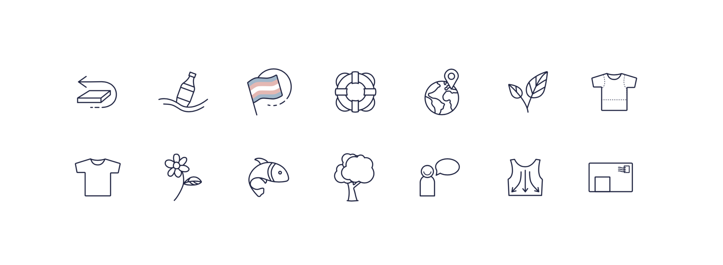
Use Icons or Infographics to quickly communicate your services or key information:
Icons are one of my favorite things to create for my branding clients. Mostly because they are just such great tools for communicating quickly and clearly as a picture paints a thousand words - or something like that! They can be used to communicate:
Different products or services that you offer
Your business values (such as eco-friendly, materials or where you are based)
Your process (such as the different steps you take when working in your business like creating, emails, collaboration)
And there you have it! 12 quick-fire adjustments and strategies that can be made to any brand to help you be a little more fun, premium or clear. And as always, I’m here to lend an ear or support you further if you are finding yourself needing to make a big shift in your business to get that brand that you love and that rewards you right back.
Hey! I’m Amy, and this is Begin Studio.
Here I create unique, thoughtful brands for small businesses in the UK and beyond. I work on projects of all sizes, from logo and branding pieces to packaging, websites and even the social media launches. I also run a small blog with resources for new designers and graduates who are just starting out in the freelance world.


