
Creating a flexible colour palette for your brand

Why are colour palettes so important? Colour is a really satisfying part of the design process, but there’s a lot to consider when choosing your brand’s colour palette. Colour is usually the first thing a viewer notices about your brand before they’ve had a chance to read your logo or go through your website. So this means your colours need to be reflective of your business and communicate your values quickly.
And if you're a designer, ensuring the client knows their palette well, it’s flexible and they understand it’s potential is an important part of the handover process.
In this post, I’ll take you through:Starting points for choosing a colour palette for your business.
My formula for choosing the perfect, flexible colour palette
Where to find inspiration:
How to put your palette to the test!
Five starting points for choosing a colour palette for your business:
1. Write down keywords for your brand values and your audienceChoosing colours reflective of your brand values are really important, so establishing what your brand values are is an essential first step. I encourage my clients to think carefully about their brand values and how they want their business to come across, and often recommend we create a mind map of their values, and write down what each value represents visually to them.
For example, if you are designing for a children’s wear brand that identifies as fun, sustainable and approachable, you might think of brightly coloured sweets, soft colours, toys and consider using a few pop colours that add a fun element into your branding. But also, because of the sustainability angle, you might want to only use bright colours found in nature - such as magenta or a sunny yellow. By writing everything out (as shown on the right), you can see how ideas connect together - warm connects with bright and sunshine, and cosy cream tones connect back to nature.
So this technique is really good for creating visual links between your colours and your values, but it also can give us valuable information on what colours we probably shouldn’t use! So to use the same example, if you wanted to use fun, sustainable and approachable as your values, you would probably avoid darker tones, black, and acidic colours. But this darker palette would be perfect for a bar or trendy restaurant whose target is young adults with fun, adventurous and edgy values.
2. think about how you can keep your colour palette flexible, easy to read and balancedIn order for your colours to be successful and easy to use - they need to use a range of tones such as neutral, dark and bright. This ensures you’re never limited by your palette, your text is always legible, and your colours complement each other.
By “balanced,” I mean that your colours can be combined in different ways (dark text on light colours, light text on dark) while still feeling harmonious and connected, giving you flexibility across all your designs. I’ll jump into this more in the next pages, but just try to keep in mind, that in most cases, your palette should be a balance of tones to give you the most freedom.
3. Check your competitorsYou never want to be seen as mimicking your competitors, even accidentally! It can cause confusion for your customers as your competitors are part of your brand community. So take a look at people in your market and ensure the brand’s colours you are considering are different enough for you to shine, and are respectful of others in your space.
4. Check the tone of your industry It’s quite normal to pick colours that match the overall conventional tone of your industry and consider what your customers expect to see. For example, eco-friendly companies often lean on green tones to represent nature and the planet, tech companies usually lean on blues and steel colours that are found in technology.
But you can also just as easily make the choice to NOT fit into your industry and set yourself apart from your competitors. An example of this is when modern banking app Monzo in the UK, launched with a trendy, neon coral tone to appear more approachable and friendly against the blues and greens of other UK banks.
Being different from your competitors is a different strategy to help you stand out boldly and can be beneficial if you need to post frequently on social media, run adverts or stand out in spaces where your competitors’ brands will also be. But if going with this strategy, I do recommend your colour palette still needs to reflect to your core values, as your customers still need to connect with you as they use the brand.
5. Pick colours that you love - kinda?If you could take one thing away from this, try to find colours that you love to work with, even if they’re not your personal favourites. You’re going to be looking at these colours everyday and integrating them in different ways in all aspects of your business - so if you love them it will make your work more fun and enjoyable.
That said, it’s not always possible. If you’re favourite colour is baby pink and you are opening up an architecture firm for tech spaces, the strongest strategy would be to go with something a little more industry-appropriate. Or maybe not? You also could create a really sleek brand made with black and white tones for the professional values, then have baby pink as a pop colour that you use for your website’s buttons to add a bit of edginess. That’s the fun part of design, you can stick to conventions or throw them out the window- as long as your colours still reflect your values, then there is room to play.
five starting points for choosing a colour palette for your business: summarySo to summarise - spend a good amount of time identifying the values you want to communicate through the branding. Think about how to bring in light, bright and dark tones so your colour palette has lots of flexibility. Keep your competitors and industry in mind. And lastly, ensure that the colours you are leaning towards will be fun for you to use.

My formula for choosing the perfect, flexible colour paletteSo when I have clearly identified my clients values, inspirations and competitors, I can start pulling together colour ideas. I look for these five things to ensure my colour palettes are easy-to-use and flexible.
Main colours to represent the brand.
These colours will be the main focus of the brand and will be supported by the other colours. I try to aim for between 1-3 main colours.A lighter tone to brighten the brand.
I like having a lighter tone that compliments the main colours but can be used when the main colours need a break.
An accent colour for a call to action or to add a sparkle of colour.
This is the kind of colour that can be used for CTAs and buttons. Preferably a tone that matches your other colours but also stands out against them so you can grab viewers attention when it really matters.
A neutral colour for the base of the palette.
Having a light neutral colour allows you to add clean space in your materials and provides a base for your more powerful main colours.A darker tone to deepen the palette and for text, allowing text to be read easier.
A deep tone in the palette is really important to allow your text to be easy to read. It also doesn’t have to be a 100% black - consider warm blacks, dark greys, dark greens - there’s lots of flexibility.
Where to find inspiration:
Now that you have a list of values that you would like to communicate, you are ready to explore light, dark and bright tones, you have looked into your competitors and industry and seen what is out there, and you are keeping in mind that these colours need to be joyful for you to use. You can jump into the inspiration stage, to spark even more ideas and see how colours are used together in the real world.
The usual suspect - PinterestPinterest is, as you may expect, my primary go-to for inspiration - but maybe not for what you think. I avoid looking at other designers or branding projects on pinterest for inspiration, once I have a sense of what values I want to communicate, as I find myself comparing their work to mine. And to take colours from other designers simply feels like (and is) plagiarism. Instead, I focus on photography. I use photography, lifestyle imagery and nature to identify the tones of food, plants and home decor for combinations that could be worth exploring. I find the patterns, pick out colours that work together, experiment with them in an Illustrator file, and keep checking my client’s target values to ensure I’m answering the brief.
It’s important to note that you can develop a set of colours and apply it to your designs and it might just not work - so make sure to take this approach with a pinch of salt, it’s a collaboration of many elements!

A random colour generator - coolors.coCoolors is a random colour palette generator that has lots of really fantastic features. If you press space, random colours appear and you can lock them in place to save them or press space again to generate a whole new range. You can also pick specific shades, which is pretty great.
I think my favourite way to use this website is to actually use it with a few colours in mind, maybe a darker tone and some bright tones - then allow it to randomise the other colours. It allows me to consider colours I wouldn’t typically think of.

Search Designs by colour - DesignspirationOne thing I really like doing, usually when I’ve already picked a palette, is to put the colours into Designspiration and see what other designs they have that match my palette.
I do this for two reasons:
To ensure nothing big comes up - like I’ve accidentally stolen the colours for a famous bank, coca-cola campaign or a brand in a similar market.
Because it’s really cool to see how other artists and designers have used these colours and see what their target audience and values were for those projects. You can then use this knowledge to figure out if you’ve made the right choice for your project.

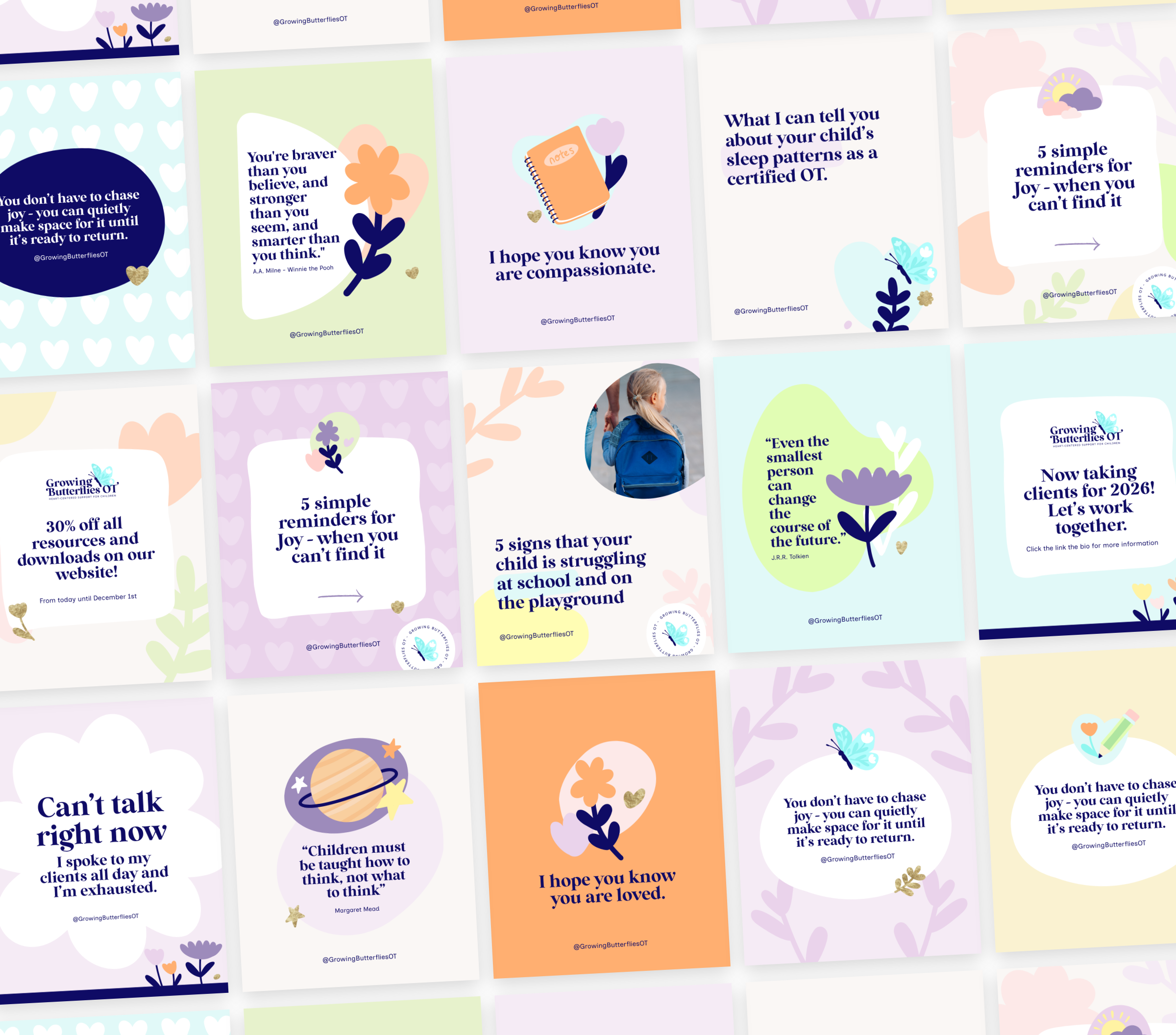
Put your palette to the test
So after all this, you should have a flexible, balanced colour palette that you love, that truly reflects your brand’s values and its place in the industry! You should also feel confident in what inspired your colours and their place within your marketplace.
Now you can apply it to some designs across your brand elements to test that it feels coherent and everything is working together well. My recommendation is to start with your website or social media. Use the darkest colour for your typography, similar to below, and try using the other colours as different backgrounds or textures. Experiment with a few different layouts and colours until you have a set that feels balanced together - and don’t be afraid to tweak the colours as you go if they feel too bright or too subtle. Trust the way they feel to you and go back and reference your inspiration if you feel unsure.
If you ever need advice, my dms and emails are open to you! And I hope that you find this exploration useful.
Amy x

Hey! I’m Amy, and this is Begin Studio.
Here I create unique, thoughtful brands for small businesses in the UK and beyond. I guide my clients from logo and branding design all the way through to packaging, websites and even the social media launch of their new business. I also run a small blog with resources for designers who are just starting out in the freelance world or are recent graduates.

For offers and resources directly into your inbox. ✨